Code and Theory is a digital-first creative agency with a growing and impressive list of clients across multiple industries. As an Associate Director at C&T, my involvement in projects was focused on partnering with product and technology directors and project leads, shepherding and mentoring designers, and policing process.
I joined the C&T team at a crucial time in the company's growth. Sr. Experience and Strategy leaders in the org were decidedly focused on process optimization from UX perspective and as a result, committed to strengthening the UX leadership.
In addition to managing three direct reports, I had the opportunity to work on a variety of projects which allowed me to dive into process management, product design, team management and experience strategy.
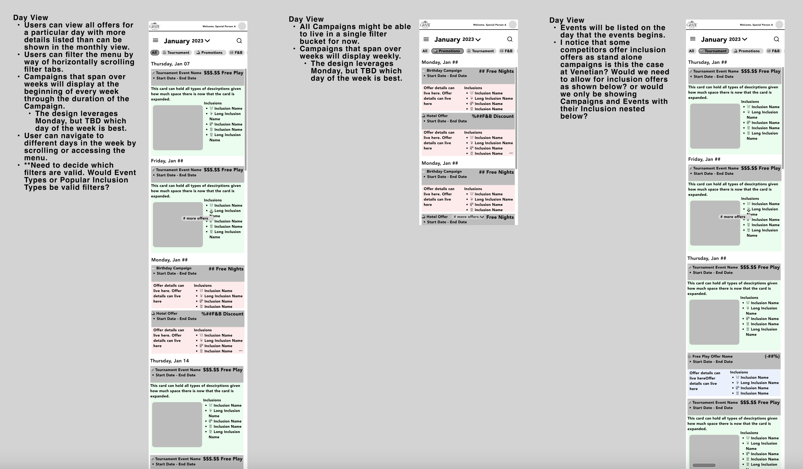
Venetian Las Vegas team had a long standing contract with C&T for general tech support and a back log design tasks. I joined the team as the sole designer to focus on these. The Unified Calendar initiative was a request to build out a Calendar that Grazie Loyalty Rewards customers could use to view all hotel events, monthly and quarterly campaigns, tournaments and their offers in one place.
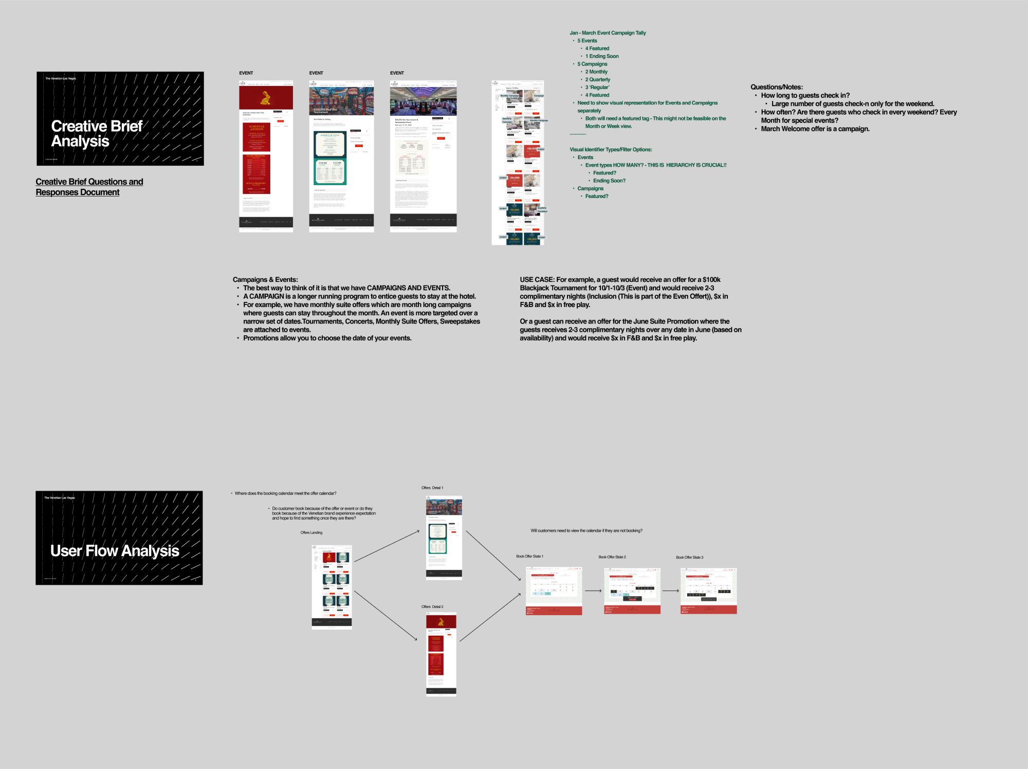
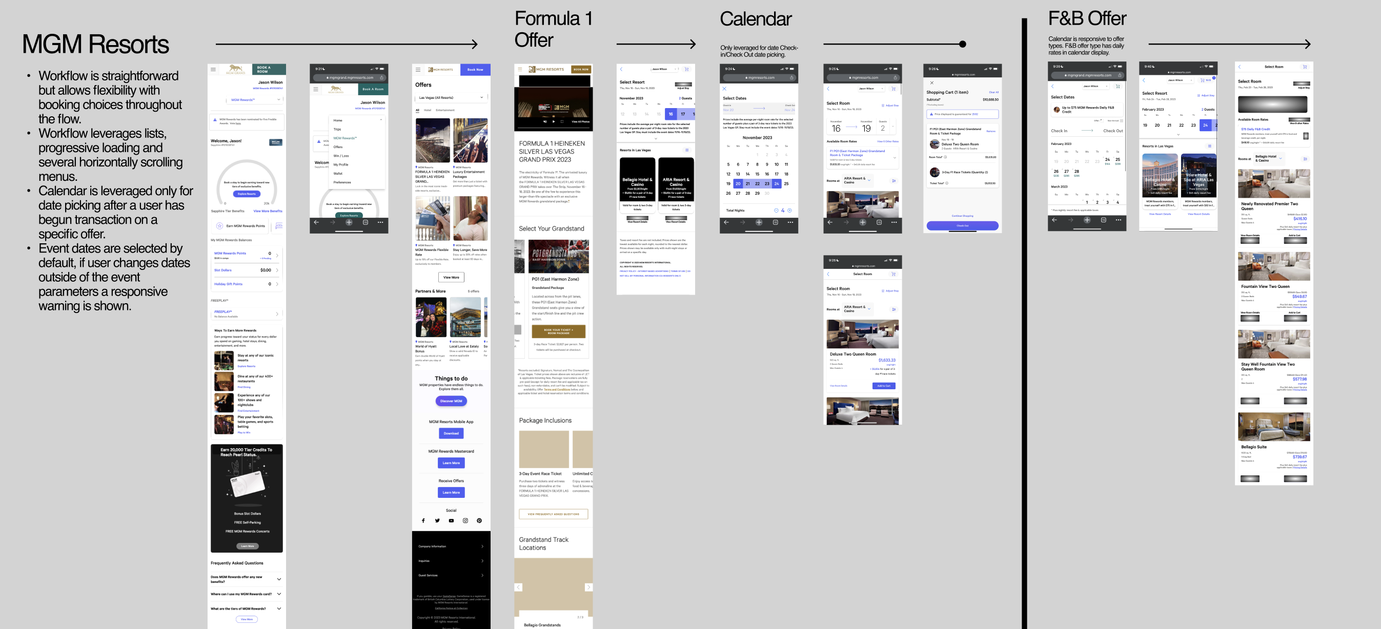
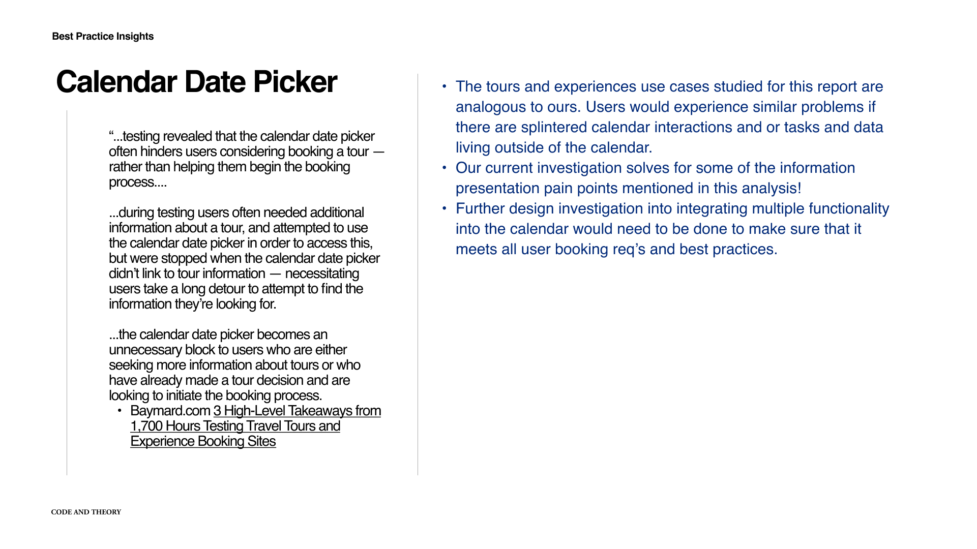
I ultimately determined that the best approach from a UX standpoint would be to step back, preserve resources and think about what a truly ‘unified’, responsive. and holistic calendar experience could be. I presented my recommendations along with a Comparative Interaction Analyses, best practice recommendations from the Baymard Instituted and some design concepts to illustrate the incomplete interaction model.
The project overall was a strategic success. After my final presentation, the Venetian team agreed that there would need to be some internal consolidation of business requirements across their business teams.
Click here to access the entire project write up in Figma!
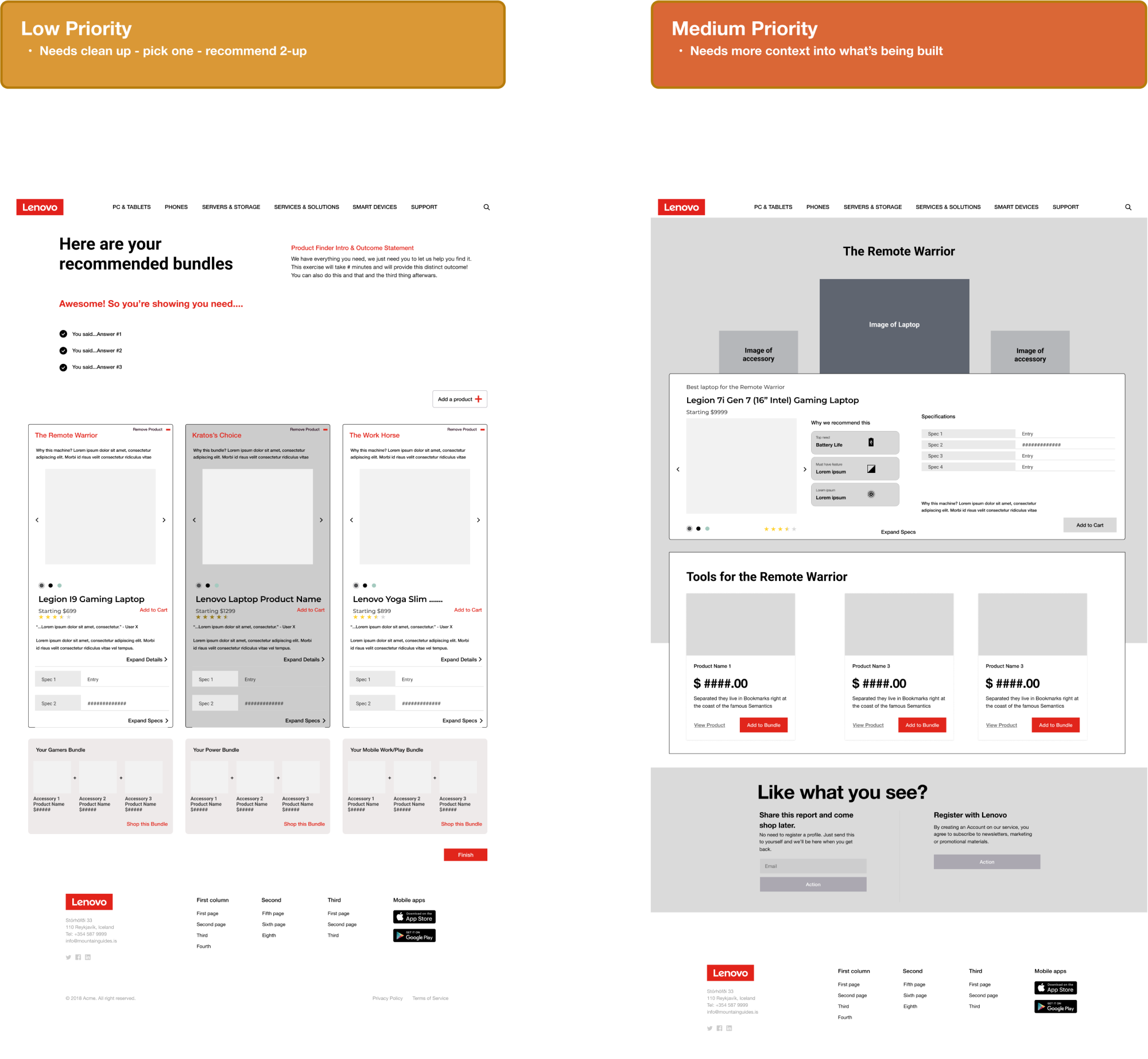
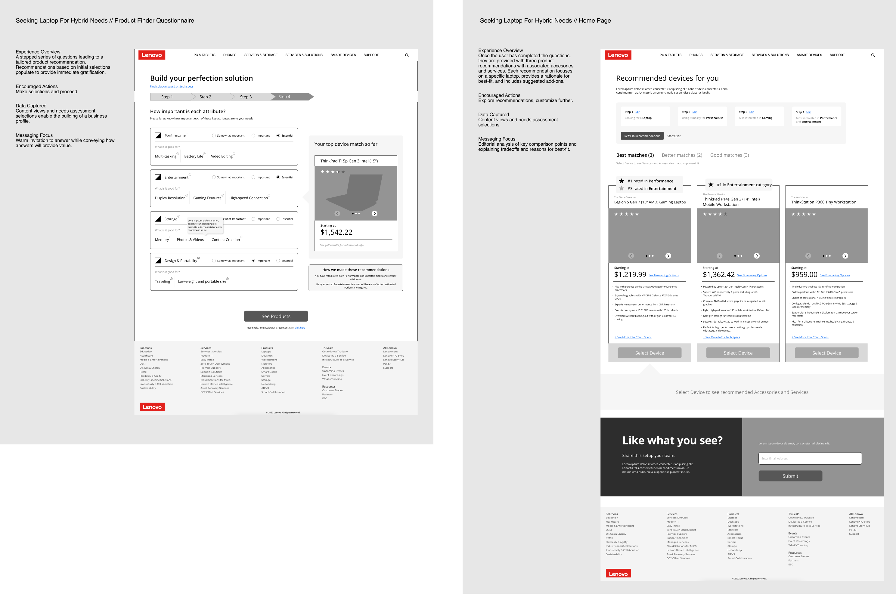
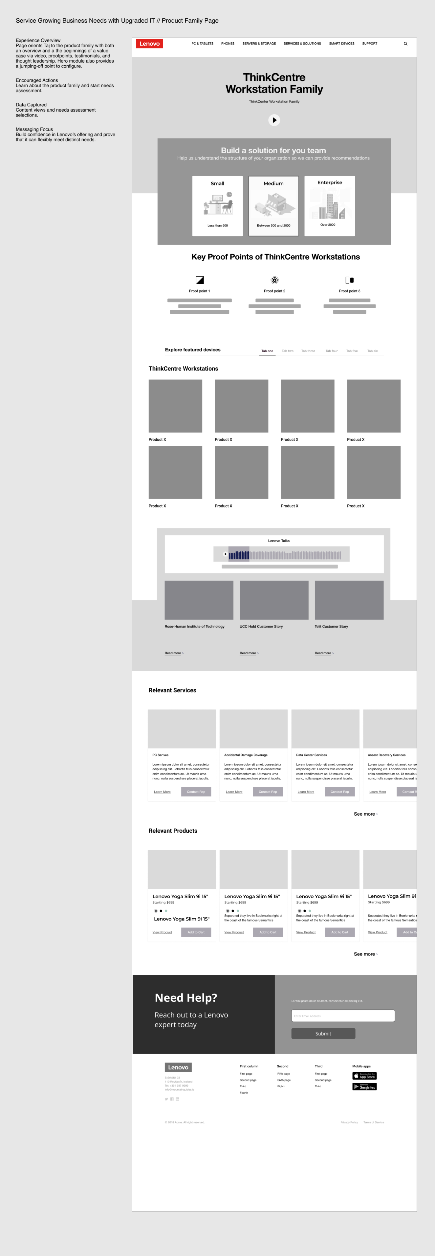
For Lenovo, C&T partnered with IBM technologists and strategists to create concepts for B2B2C solution that would drive engagement with consumer shoppers and small business and enterprise sales.
I partnered with a Director of Experience Strategy off and on and also worked with a Jr. Designer to round out the UX team and we collaborated closely with the Director of Transformation Strategy, Director of Technology, a Product Strategist, a Content Strategist to create a robust persona driven concept for what Lenovo could become for its clients
Part of the approach was to think about how the landing page could provide a dynamic experience that would be unique for First-Time Users and bespoke for known/returning users based on the signals that they provide through their interactions with Lenovo across the digital journey
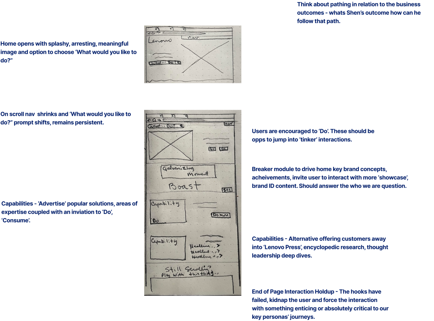
I focused my attention on two of our proto personas that we created along with our Strategy and Business partners, trying to think of ways to make the experience engaging enough for Brendan, our gamer/everyday user persona, while also thinking about ways to engage and meet the critical business needs of our CTO Persona, Shen.
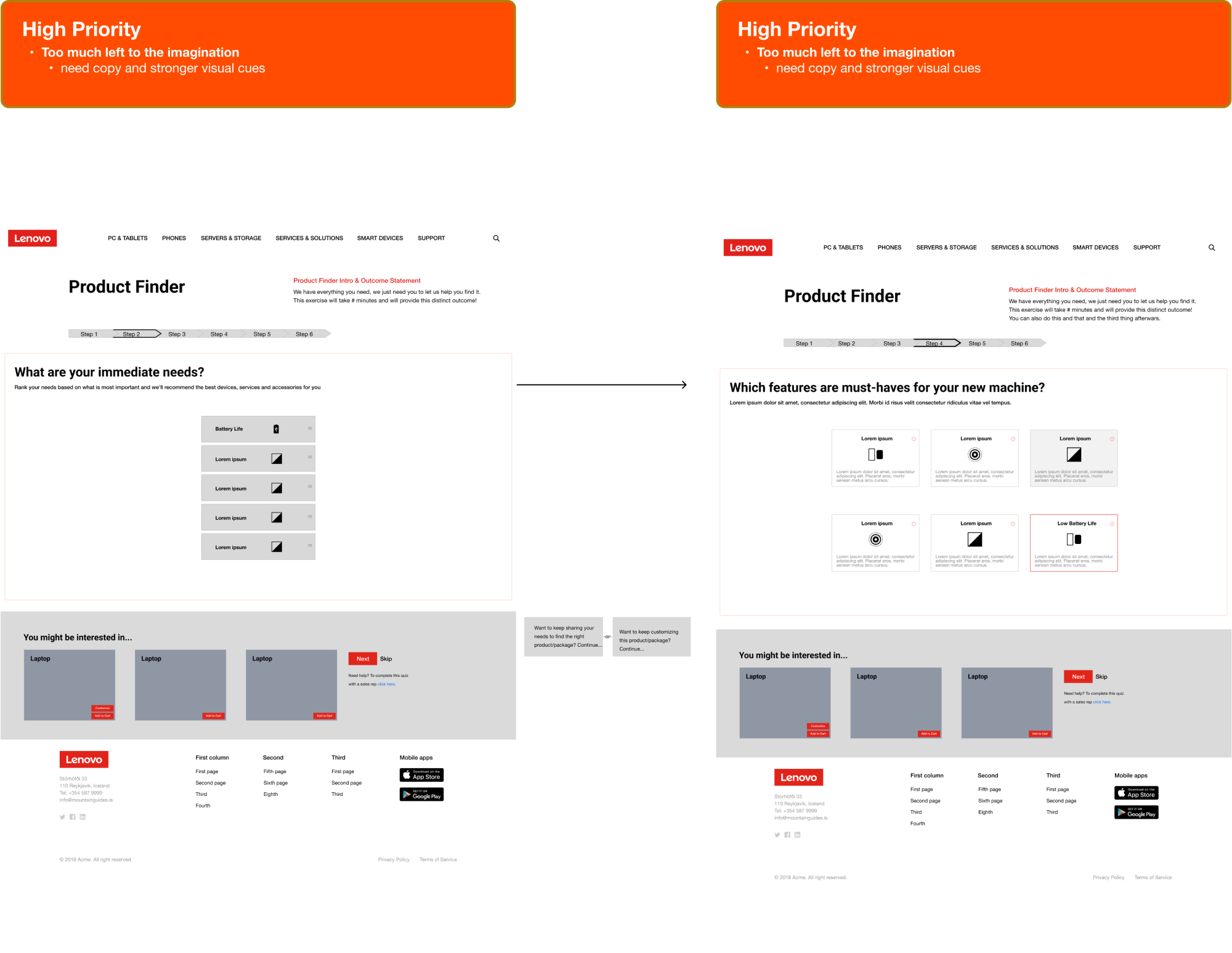
We decided that Product Finder quiz would be an element that would appear in all of the persona’s experiences. It would be a vehicle to illustrate to the client how we would entice users to provide the necessary signals needed to populate bespoke content throughout the site and throughout the customer journey.
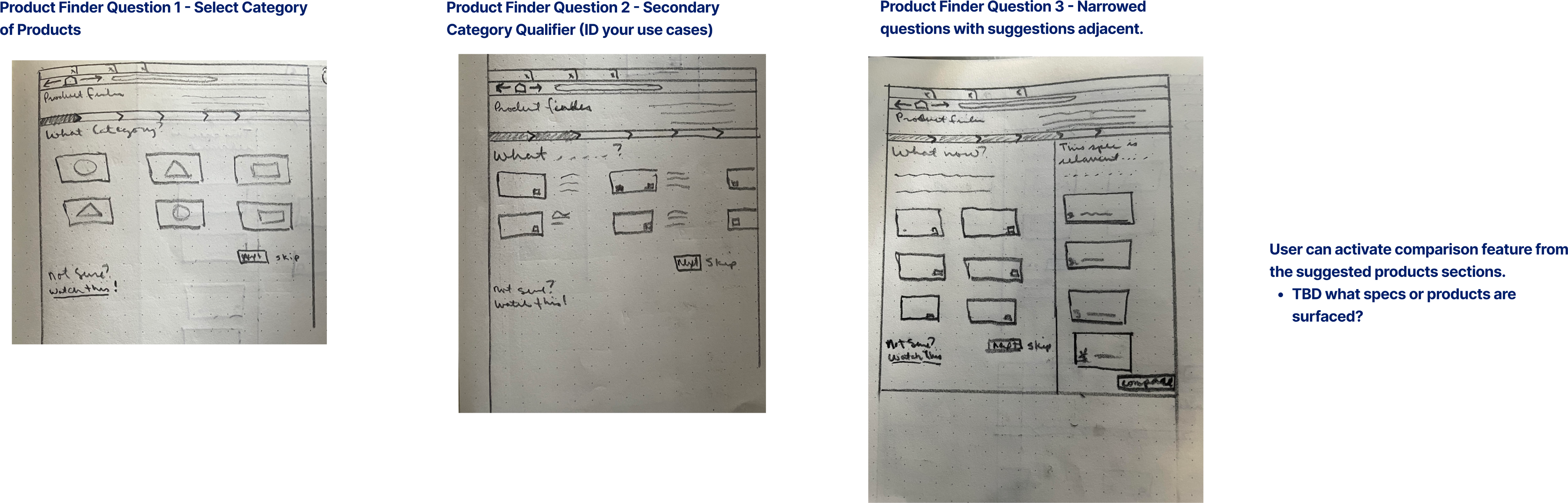
As a team, we continued our iterative process of refining the screens and their component zones and narratives, based on the our Director of Strategy’s discretion.
The final presentation of the wireframes coincided with an extended time away from the office, and as is the nature of working in the agency, I was moved to another project upon my return. I did learn that as a result of our efforts, we won a contract to redesign the B2C e-commerce experience.

Click here to view more information about this project in my write up in Figma!
Zappos came to Code & Theory in desperate need of a facelift. The company had identified a serious need to wade into the millennial men’s running and performance market and Gen Z markets in general.
‘This looks like malware.’ I’m paraphrasing a user response that sticks with me. It was indicative of the state of the site, the degraded patterns being leveraged on Product Detail and Product List pages in general along with the Account management and Search interactions.
I joined the team as Interaction Designer and owned the Product Detail and Product List pages in addition to shepherding the work for three Jr. Designers. Zappos was always thrilled and delighted with our work and our design solutions consistently exceeded all of their expectations.
UX started our process with a rigorous audit of the entire site which we documented page my page in Airtable. Concurrently, the UX design team partnered with the Product Strategy team to audit the Baymard Institute library of e-commerce guidelines to align their best recommendations to each of the page templates and components.
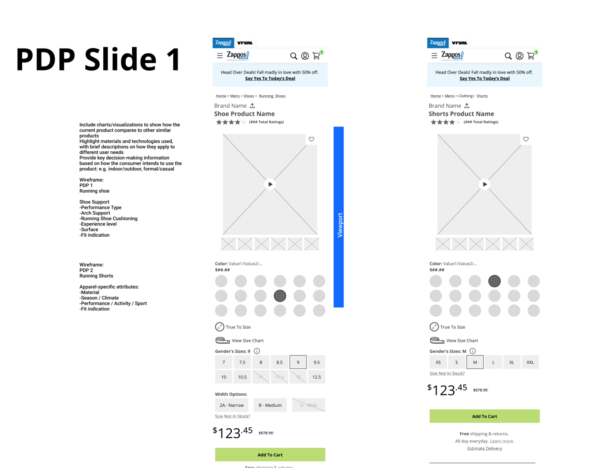
I dove into designing the updated components template variations to align with the narratives that our Strategy Directors were using to guide the design Sprints and client feedback presentations. Using a mobile first approach, I set out to see how I might upgrade each of the components while aligning with the Baymard Guidelines that were relevant respective to the component.
I updated the PDP Buy area and the placement of the elements within in it to optimize the hierarchy of the information and interactions within the component considering the mobile viewport height.
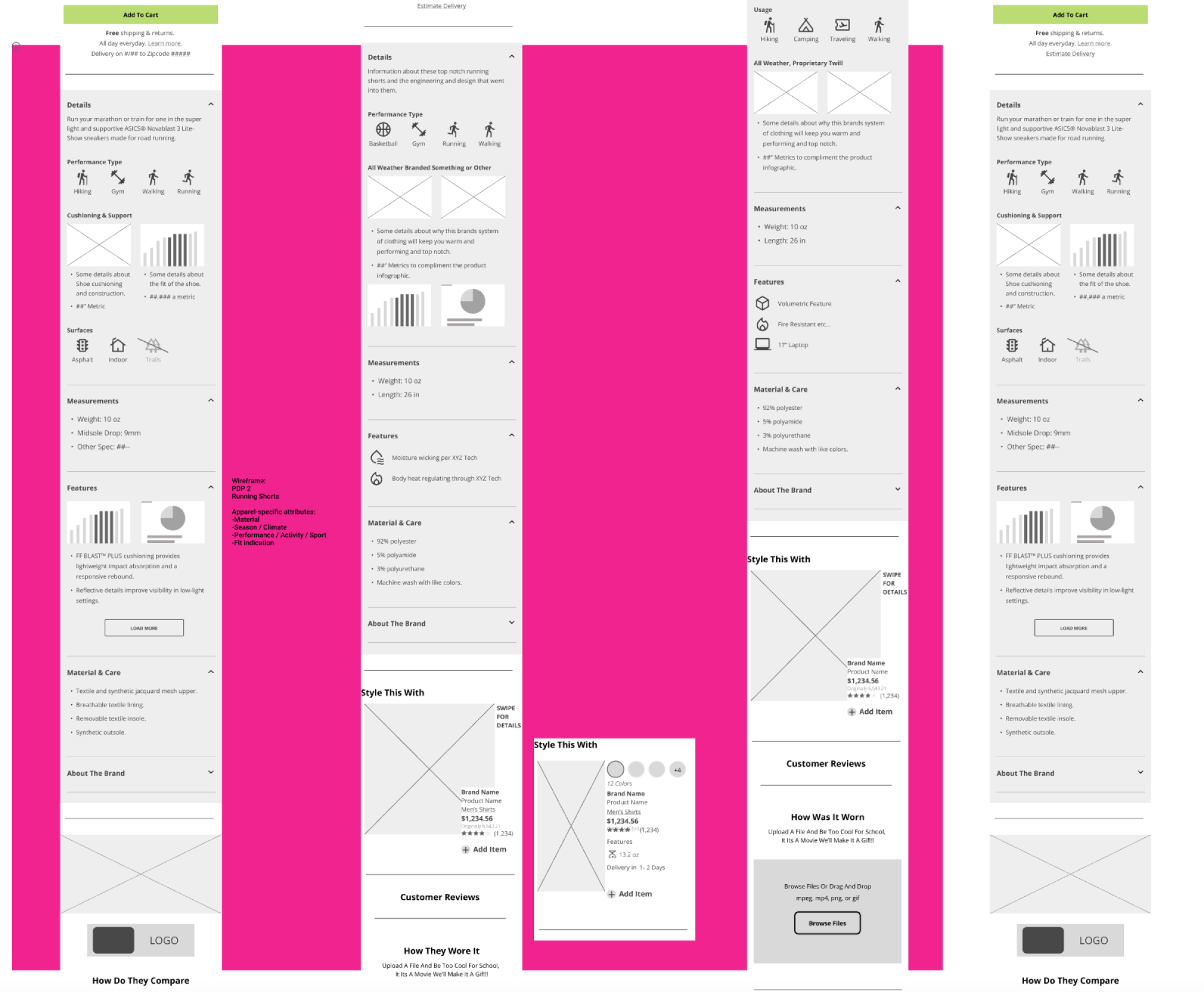
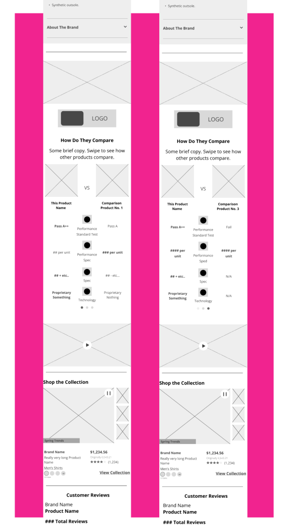
I am particularly proud of my concept for product comparison. I had initially thought this component might align with the branded product experience and it was almost shot down by our strategist, but over time the component gained popularity and grew into quite a robust and useful addition to the template. As an added bonus, we were able to present the component as correlative to that which exists on Amazon’s PDPs. Amazon owns Zappos.
I created some zoning and requirements notes for mobile and desktop for the Product Information Area to support the updated Product Information section. I used what I had learned from my initial PDP audit to make sure that we were designing for all of the known Product Information variations.


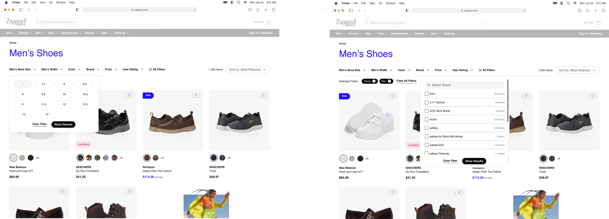
I decided to dive a little deeper into the design based on the Baymard recommendation that sometimes a horizontal filter solution could perform better than a vertical left-aligned filter row. As a user myself, working with the left-aligned filter row is tedious and oftentimes you have to repeat the work of scrolling up and down in order to see the filter list and the adjustments in the product list.
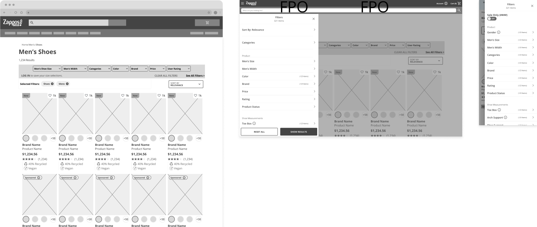
Baymard’s observations noted users were generally blind to the presence of the left-oriented filter rail and assumed that the sort dropdown at the top of product lists was in fact the filter and interacted with it instead. They completely ignored filter set on the left side of the screen. With this in mind, I set about challenging the status quo and designed an alternative Horizontal Bar.

Unfortunately, I was moved to another project before this one was completedbut am happy to see some of our updates live on Zappos.com
Click here to view more information about this project in the write up in Figma!